Wednesday, 26 January 2011

About Me


I am a creative individual with a unique imagination and a desire to create visually exciting outcomes. I am doing Art and Design based subjects at A level which emphasises on the fact I love Design. I am a kinesthetic learner therefore enjoy learning whilst being active or on a practical basis. I am hard working, independent and enthusiastic. I feel London Metropolitian University would be a great place to attend to do an Interior Design course as London is a very cosmpolitian city and is well established, offering the students a great deal of learning opportunities.


I would love to live in London during my learning development process as I believe there are so many opportunities for part-time jobs and I would be able to commute to my hometown, Harrogate within a short time. I have also heard the nightlife and student union are fun,exciting and a great place to socialise.


I really hope that I will recieve an offer from London Metropolitain University for this Interior Design course as I know of people who have attended London Metropolitian University and have become successful Interior Designers.


I look forward to hearing from you in the very near future.


Yours Sincerely

Xtreme Play Photography

This is an image from my latest photography project called Xtreme Play. I have taken this photo capturing the movement and I have edited this image using Photoshop to create an exciting and lively atmosphere. I used colour-selection to select the mid air ski jumper to emphasize on the theme of Xtrme Play.

Initial Design Ideas


This is another example of deisgn development. This particular page shows possible draw ideas which consists of baskets and softer, more flexible materials. It also shows more useful functions my design could include such as coasters. The circular shapes proved to be more diffecult to manufacture in wood and when I issued a questionnaire to pupils they preferred the more angular design.

Development Sketch

To develop my initial design ideas I experimented by sketching out different possibilities. This included different shaped draws, bases, lighting ideas for the mirror and different materials. Further into this project I will use CAD to make measurements more accurate.

Light-up Storage with Mirror


This is the final full size product I designed and manufactured in 2009. The dimensions are approximatly 600mm x 400mm x 350mm high. It includes 2 recessed LED lights which are opperated by mains electricity.

Tuesday, 18 January 2011

Floor Plan


This is a floor plan of Lynx Menswear, a retail shop I work in at the weekends. Although this is not something I have done at school I am passionate about Interior Design and practice drawings at home. This particular drawing is not drawn to scale but is an accurate drawing of the layout of Lynx. It shows the actual shop floor with dividers showing the changing rooms, staff toilets, kitchen and fire exit.

Monday, 17 January 2011

Image Within An Image


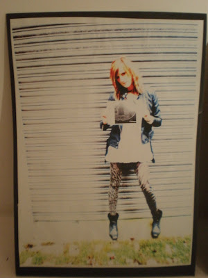
This photo is another final image from an exam I did for AS Photography. I chose this particular image as I think the texture of the wall and the patterns on the models leggings contrast very well. By editing this image it has emphasised the great pattern and colouring of the stone wall and also shows the perspective by the angle.

Image & Text Photo


This image is one of the final outcomes from my AS photography exam. I chose the topic "Image and Text" for the exam so to start of my research I analysed some photographers work who use building with words and text projected onto them at night. I soon came up with the idea of an image within another image. I took photos of a few buildings which caught my eye such as the building in the picture the model is holding. I then Photoshoped text onto the image contrasting with what the model is doing. This particular image is inspried by Gillian Wearing who took photos of everyday people holdig up a piece of paper with what they are thinking or feeling. In my image the text says "Im Shy" which contrasts with the models pose as she looks very confident and energetic. I then used my editing skills to make the model more vibrant and the overall image more interesting.

Saturday, 15 January 2011

Paintings

I created these paintings in 2009 as a part of my GCSE Art folder. To start this project I researched different artists such as Andy Worhol to establish the techniques I would have to use. To get the desired outcome I took pictures of peoples eyes and lips sometimes applying make-up. I then used photoshop to pigment the images internal colours to create a pixcelated style of image. I painted these two canvases with acrylic paints and to create texture I used a sponge around the eye and bottom of the lips.


Design Idea Sketches


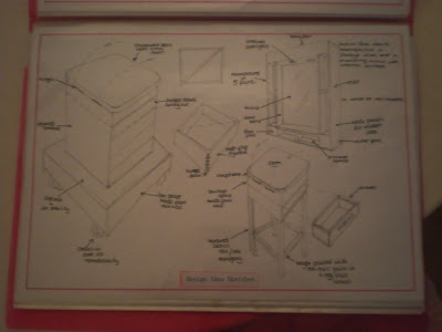
This is one of the design ideas pages in my Y13 Product Design folder. I have brainstormed the different types of storage units, heights,materials and fixtures to begin to develope the ideas that work and use the ideas that are not so great as experiments and research. This page shows the different draw designs, stools structures and a mirror which was going to be manufactured following the same style as the stool so if it was to be sold on the market it would be sold as a storage set.

Product Design GCSE


For GCSE Product Design we were set a design brief to create a light up storage unit. I chose to design and manufacture a femanine jewellry storage unit with a mirror in the centre as I thought it would be a useful unit to have in a bedroom. This is a prototype of my desired product. This model is made up of different sections manufactured from Plywood, MDF,cardboard and dowel.I used the laser cutter to cut out each part of the unit and stuck it together with adhesives and fixtures. During the process I used 2D design and CAD in order to make all parts and components accurate.

Fashion Canvases


I created these canvases in Y11. I chose the theme of Fashion and Textiles to experiment with different textures and materials instead of just painting. To start of this series I took photographs of a model in a ball gown style dress. I then used carbon paper to transfer my preffered photos onto the cloth covered canvas. I used a number of different techniques and objects such as sewing, coloured sands, buttons and nettings to create an exciting and unique final series. The outsides of the canvases are watercoloured painted to create a border to the internal image, this also set the colour coordinated outcome. I used hot glue to fix the blue silk material to the base of the transferred models image which gave a smooth and eye catching alternative to the dress she was wearing in the initial images. I used netting to create the middle canvases dress by sewing around the transferred image with green thread. I used red sand and multicoloured thread to create the final image.(red) To finish of my project I researched different words used varsely in the fashion and design world and wrote these words around the focal point.

Prototype

This year for my final product design project I am designing and manufacturing a storage unit incorporated into a stool design. I have made a 1/4 scale model out of expanded polyureathane as it is easy to work with and lightweight. The model consists of layers of polyureathane acting as MDf which will be used in final manufacture. The seat will be made from 25mm mdf with foam under the leather in order to make the stool as comfortable as possible. The well is 75mm deep and will hold all sorts of cosmetics and jewellary. The draw is 50mm deep and will also act as storage for bits and bobs. I have painted the base of this structure silver as I would like to have a silver base structure in the final product.I have not yet decided on a definate base but it will have a reinforcement sheet at the base of the storage structure in order to make the structure durable and safe.